How to Write “Alternatives” and “Competitors” Pages for SaaS That Rank (and Convert)
Why alternatives and competitor pages are so powerful
Most blog posts target curiosity. Alternatives pages target commitment. Someone searching “software alternatives page” or “competitor comparison page” is usually trying to pick a shortlist, validate pricing, or confirm a dealbreaker.
Your job is to be the most helpful decision companion in the SERP. That is exactly the spirit behind Google’s guidance on creating helpful, reliable, people-first content, and it is the mindset that makes these pages rank and convert at the same time.
What changed and what is new (and why thin comparison pages keep dying)

In recent spam-policy updates, Google has been explicit that mass-produced, low-value pages can be treated as spam, including content created at scale with little original value. If you are publishing 50 “Best X alternatives” pages that all read the same, you are playing chicken with Google Search spam policies.
Google also rolled out changes alongside the March 2024 core update and spam policy updates that put even more pressure on sites that rely on unoriginal templates, doorway-style pages, or low-effort “SEO pages” that exist mainly to capture traffic.
Pick the right page type (the “intent match” doctrine)
1) “X alternatives” pages (the classic alternatives hub)
This format wins when people are broadly dissatisfied and looking for a new category fit. Examples include “Semrush alternative,” “SpyFu alternatives,” “rank tracker alternative,” or “software like QuickBooks.”
- Best for: capturing “shopping” intent across multiple competitors
- SEO goal: rank for “best alternatives,” “similar tools,” “cheaper alternative,” and “free alternative” clusters
- Conversion goal: position your product as the safest choice for a specific use case, not the universal winner
2) “X vs Y” pages (the duel page)
This format wins when the searcher is already down to two options and wants a tie-breaker. These pages can convert extremely well because the decision is already constrained.
- Best for: branded comparisons (your brand vs the category leader)
- SEO goal: win “vs pages seo” terms and comparison landing page intent
- Conversion goal: remove fear with clear differentiation and proof
3) “X competitors” pages (the competitive landscape page)
This format is ideal when the searcher wants a list of market players, often for procurement, agency evaluation, or internal research. Think “competitor pages that rank” style queries where the user expects breadth.
- Best for: categories with many similar vendors
- SEO goal: rank for “competitors,” “top competitors,” and “tools like” queries
- Conversion goal: frame your brand as the clear specialist for a scenario
Keyword strategy: build clusters, not one-offs
Alternatives SEO works when you treat keywords like a family tree, not a list. One “best Semrush alternative” page can also capture “Semrush free alternative,” “Semrush cheaper alternative,” “free tools like Semrush,” and “similar to Semrush” if the page is structured to answer each variant clearly.
Use your primary keyword for the page’s core intent, then add sub-sections that address the modifiers people care about: free vs paid, cheap vs premium, open source vs hosted, beginner vs advanced, and niche use cases. That is how you turn “saas alternatives seo” into a repeatable system instead of a content lottery ticket.
For regulated or high-trust industries (healthcare, legal, finance), also cluster by risk and compliance needs. When you do this well, you are aligning with the quality expectations described in the Search Quality Evaluator Guidelines without turning your page into legalese.
The page blueprint that ranks (and does not feel like a content farm)

Above the fold: confirm intent in 5 seconds
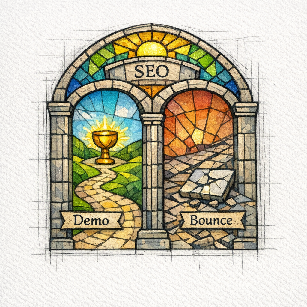
Your headline and first paragraph must tell the reader they are in the right place. Say what the page covers, who it is for, and what the reader will be able to decide by the end.
Then add a short “fast answer” block. Not a table, not a wall of text, just a scannable set of bullets.
- If you want the closest 1:1 replacement: recommend one option and say why
- If you want the cheapest viable alternative: recommend one option and define the tradeoff
- If you want the best option for a specific use case: recommend one option and name that use case
State your evaluation method (or do not pretend you evaluated)
Comparison pages rank longer when they show real experience and clear criteria. If you tested tools, say what you tested. If you interviewed customers, say that. If you only researched public information, be honest and cite what you can.
This aligns with Google’s guidance on people-first content, because it forces your writing to be about helping the reader decide, not gaming a keyword.
Build sections around decision questions, not feature dumps

Most readers do not care about 47 features. They care about a few decision questions: price, ease of use, support, reporting, integrations, reliability, and “will this work for my situation?”
Structure your page with mini-verdicts. Each vendor should have a clear “best for” and “not ideal for,” so your content feels like guidance, not a brochure.
- Best for: one sentence that names the ideal customer profile
- Why it is a strong alternative: 2–3 bullets tied to outcomes
- Tradeoffs: 1–2 bullets that prevent buyer’s remorse
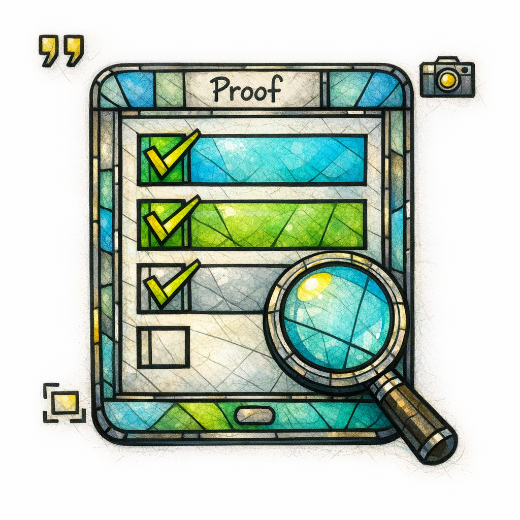
- Proof: screenshots, workflow notes, or cited docs where applicable
Answer “free,” “cheap,” and “open source” with precision
These modifiers create traffic, but they also create distrust if you are vague. If the query is “free alternative,” make it crystal clear what “free” actually means: free trial, freemium tier, open source, or limited plan.
Do not hide the catch. If you do, the reader will bounce, and that is how your “best free alternative” page becomes a revolving door instead of a lead machine.
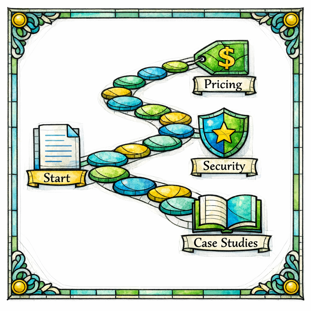
Use internal links like a guided path (not a maze)
Alternatives pages should not be dead ends. Link to the next best page for the reader’s situation: integrations, use cases, pricing, onboarding, security, or case studies.
But keep it purposeful. If you add links just to “spread PageRank,” you will create clutter instead of clarity, and clarity is what converts.
Outbound links: cite responsibly, label relationships
Sometimes you should link out, especially when referencing official docs, public pricing, or standards. If you have affiliate relationships or sponsored placements, label them and use the right link attributes as described in Google’s guidance on qualifying outbound links.
This protects trust with readers and keeps your comparison content from looking like a monetized trap. Your goal is to be the priest of decision-making, not the pickpocket outside the temple.
Structured data and SERP presentation (do this carefully)
Comparison pages can earn rich results when they are eligible, but only if you mark things up correctly and honestly. If you use reviews or ratings, follow Google’s requirements for review snippet structured data and avoid marking up content that is not a real review.
Do not chase rich results at the expense of trust. A clean page that answers the query thoroughly will outlast a gimmick, especially under spam policy scrutiny.
How to make competitor pages convert (without turning them into ads)

Give the reader a decision, then give them a next step
Ranking gets you visits. Conversion gets you revenue. The bridge is a clear recommendation that matches a real scenario, followed by an action that is obviously helpful.
- For high-intent SaaS: “See a demo,” “Try it,” “Calculate ROI,” or “Talk to an expert”
- For home services: “Get a quote,” “Check availability,” or “Book same-day service”
- For healthcare and health-adjacent: “Request a compliance walkthrough,” “See security overview,” or “Talk to an implementation lead”
- For legal: “Speak with intake,” “Get a case evaluation,” or “Review practice area fit”
Position by use case, not by ego
The highest-converting competitor pages do not claim “we are best for everyone.” They claim “we are best for this kind of buyer,” and then prove it.
If you want to convert someone searching “accounting software like QuickBooks,” you do not win by yelling. You win by naming the exact situation: multi-entity accounting, contractor invoicing, payroll complexity, or cleaner reporting.
Include “switching” content that lowers fear
Alternatives pages are often migration pages in disguise. Add a short section that answers: “How hard is it to switch?” and “What happens to my data?”
You do not need to overpromise. You just need to show a clear path, because uncertainty is the demon that kills conversions.
Common mistakes and misconceptions (the sins that get pages ignored)
Mistake 1: Writing the same page 20 times with different brand names
This is the fastest path to thin, unoriginal content. When pages are templated with minimal differentiation, they drift toward the kind of scaled, low-value content targeted by Google’s spam policies.
Mistake 2: Treating “alternatives” as an excuse to smear competitors
Negative, unsubstantiated claims create credibility debt. You can be direct about tradeoffs, but stick to verifiable differences and real user scenarios.
If you cannot support a point with experience, documentation, or a clear explanation, it does not belong on a page meant to build trust.
Mistake 3: Ignoring “why this page exists” (and writing for bots)
If the page is primarily built to capture a keyword, it will read like it. Google’s guidance on helpful content is a simple check: would this page still be valuable if it never ranked?
Mistake 4: Doorway-like location spinoffs for multi-location brands
Local and multi-location companies can use comparison pages, but cloning the same competitor page for 30 cities without meaningful differences is risky. Google explicitly calls out doorway-style patterns in its spam policies, and the safest approach is to localize only when you have genuinely local value.
Mistake 5: Thinking E-E-A-T is “just for healthcare”
Trust is not a niche requirement. Even in marketing tools, rank trackers, and landing page builders, readers want evidence that you know what you are talking about.
The Search Quality Evaluator Guidelines give you a practical lens: show experience, show expertise, and show the signals that make a cautious buyer feel safe.
A practical writing template (copy this structure)
Use this as a repeatable outline for any “software alternatives page” or “competitor comparison landing page.” It works for “Semrush alternative,” “Unbounce free alternative,” “WordPress Elementor alternatives,” “Atlassian status page alternative,” and everything in between.
- Intro: who this page is for, what you compared, and the quick verdict
- Best alternatives at a glance: 5–8 scannable mini-verdicts
- How we evaluated: criteria and what “best” means in this context
- Alternatives list: each option gets best-for, tradeoffs, and ideal buyer
- Side-by-side decision questions: pricing approach, usability, reporting, integrations, support, migration
- Which one should you choose? recommendations by scenario
- FAQ: free vs paid, cheap vs value, who should not switch, how long switching takes
- Next step: demo, consult, quote, or guided audit
What to do next (a checklist you can hand to your team)
- Pick the correct intent format: “X alternatives,” “X vs Y,” or “X competitors.”
- Define your evaluation criteria and add evidence (screenshots, workflows, or documented references).
- Write mini-verdicts for each option: best-for, tradeoffs, and who should skip it.
- Add sections for “free,” “cheaper,” and “similar tools” modifiers where relevant.
- Improve trust signals: clear authorship, update cadence, and honest limitations.
- Use outbound link attributes properly when relationships exist, following Google’s outbound link guidance.
- If you add ratings, follow review snippet structured data requirements and do not fake reviews.
- Review the page against people-first content principles before publishing.
Get a free SEO audit today (and take the SEO Bible with you)
If your competitor pages are not ranking, not converting, or quietly attracting the wrong kind of traffic, let Content God look under the hood. Get a free SEO audit today!
And if you want the doctrine that turns scattered content into a system: Stop praying for better search results — download your free copy of the SEO Bible and learn the true path to SEO Salvation.