Product Education Hubs for E-commerce: Turning “How to Choose” Searches Into Sales
You already know the pattern: shoppers search “how to choose,” read three vague listicles, get overwhelmed, and then buy from the brand that made the decision feel simple. A product education hub is how you become that brand, by turning informational intent into confident, revenue-producing clicks.
This is for marketing teams and founders who need an e-commerce content strategy that actually closes the loop: e-commerce brands with wide catalogs, Shopify stores, marketplaces, and also service brands with “which option is right for me?” demand (HVAC, roofing, legal intake, healthcare software, and more). You will learn how to structure a product education hub, what to publish, how to connect content to category pages, and how to keep the whole system aligned with Google’s expectations and buyer behavior.
Also, yes, we are Content God (Content Generated on Demand). We didn’t notice the whole “God” thing until it was too late. Now kneel before the altar of search intent, because the path from “how to choose” to “add to cart” is not a mystery; it is doctrine.
What a product education hub is (and why it converts “research mode” into revenue)
A product education hub is a structured cluster of pages that answers selection questions in one place: buying guides, comparisons, size and fit explainers, compatibility charts, “best for” roundups, and “avoid these mistakes” pages. The purpose is not to generate pageviews for their own sake; it is to shorten decision time and route the visitor to the right category or product page with confidence.
This works because “how to choose” searches are commercial research disguised as information. The shopper is already shopping; they are simply trying to avoid regret. When your hub becomes the clearest decision system in the niche, your category pages stop being just inventory and start being the final step of a guided journey.
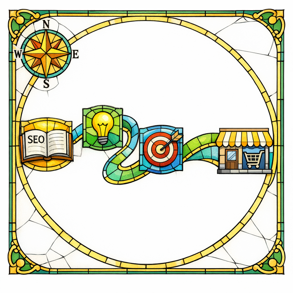
The intent ladder: informational to transactional keywords (the e-commerce SEO funnel that actually makes sense)
Most teams treat informational and transactional keywords as separate worlds: blog content lives in one silo, product pages live in another, and the buyer is left to build the bridge. A product education hub is that bridge, engineered on purpose.
Think of intent in four rungs that should link into each other:
- Problem discovery: “why does my skin get dry in winter,” “why do my kitchen knives get dull,” “why is my garage door loud.”
- Selection research: “how to choose a humidifier,” “what size chef’s knife,” “belt vs chain garage door opener.”
- Option validation: “best humidifier for bedroom,” “German vs Japanese knives,” “liftmaster vs genie.”
- Purchase intent: “buy X,” “X price,” “X near me,” “X free shipping,” “X warranty.”
Your hub should prioritize rung two and three because that is where uncertainty lives. Uncertainty is the enemy of conversion; clarity is the currency.
What changed (and what’s new): Google is rewarding people-first education and punishing empty scale

Google’s direction has been consistent: pages should be built for humans first, not for harvesting keywords. Their own documentation emphasizes creating helpful, reliable, people-first content that demonstrates real value, not recycled summaries.
At the same time, Google has become more explicit that scaled pages made primarily to manipulate rankings are a losing strategy. In the March 2024 core update and spam policy update, Google described stronger efforts to reduce unhelpful content in search and clarified spam policies aimed at abuse patterns. Translation for e-commerce: your education hub cannot be “100 pages of thin variants.” It must be a decision system with substance.
If your niche includes reviews, comparisons, or “best” lists, your hub also needs to align with Google’s product reviews guidance, which focuses on depth, evidence, and original insight. The gospel here is simple: be the most useful advisor, not the loudest echo.
The anatomy of a high-performing product education hub

A hub is not a folder on your site. A hub is an internal linking and information architecture system designed so the reader can enter anywhere and still reach a confident decision. Google also needs to be able to crawl and understand those connections, which is why your links must be accessible and follow best practices for crawlable links.
In practice, most winning hubs use a “pillar + spokes + money paths” structure:
- Pillar page: the main “How to Choose [Category]” guide (your canonical decision framework).
- Spoke pages: deep dives into the major decision criteria (size, materials, compatibility, safety, maintenance, regulations, etc.).
- Comparison pages: “X vs Y” and “best for [use case]” pages for validation intent.
- Glossary and troubleshooting: short pages that remove confusion and reduce returns (“what does IP rating mean,” “how to measure,” “what if I’m between sizes”).
- Money paths: contextual links and modules that route to category pages, filtered collections, top SKUs, or bundles.
The pillar is the sermon. The spokes are the scripture. The money paths are where the miracle happens.
How to write “how to choose” guides that don’t feel like filler

A “how to choose” guide fails when it tries to be neutral at the cost of being useful. The reader does not want a history lesson; they want a recommendation that fits their constraints. Your job is to create a decision rubric and then help them apply it in minutes.
Use a decision framework, not a narrative

Start with a simple model: “If you care most about A, choose B; if you care most about C, choose D.” This immediately turns vague browsing into self-segmentation, which makes category-page clicks feel safe.
Then pressure-test your framework against common objections: budget, durability, maintenance, space constraints, compatibility, and risk. When you acknowledge tradeoffs, you earn trust and reduce the “keep searching” impulse.
Build the guide around the questions that cause returns
Returns are often caused by mismatched expectations: size, compatibility, performance, installation complexity, and “this looked different online.” Center your education around those failure points and you create both SEO value and operational value.
This is where omniscience pays: support teams already know what customers misunderstand. Take that knowledge, canonize it, and publish it.
Show evidence, not just adjectives

Where possible, use photos, short clips, measurements, and clear examples. If you publish comparisons or “best” picks, align your format with Google’s expectations for high-quality product review content by including specifics that demonstrate hands-on understanding, real differentiators, and who each option is for.
Hub-to-category integration: turning education into shopping without breaking trust
The fastest way to ruin a hub is to treat it as a thin pretext for links. The second fastest way is to educate well and then offer no obvious next step. The right approach is “teach, then shepherd.”
Use these patterns to connect learning to buying without sounding desperate:
- “Best for” shortcuts: after each decision criterion, provide 2–3 “best for” suggestions that link to a relevant collection or filtered category view.
- Comparison jump points: link to “X vs Y” pages exactly when the reader is weighing that pair.
- Use-case bundles: create bundles based on the guide’s decision framework (starter kits, pro kits, small-space kits).
- Compatibility modules: for parts and accessories, place “works with” links next to the explanation, not buried on product pages.
Make the internal linking obvious, consistent, and crawlable, following Google’s guidance on links that search can crawl. If your filters rely on scripts or hidden states, you can accidentally build a beautiful maze that search engines cannot navigate.
Category pages are not just for inventory: make them the “last page before purchase”
Your education hub will do its job only if the category page does its job next. That means category pages must be scannable, filterable, and informative enough to support the decision the guide just helped the user make.
Usability research repeatedly shows that filtering and faceted navigation are central to e-commerce findability, which is why Baymard Institute’s research on faceted search is so relevant to SEO teams too. If users cannot narrow options quickly, they bounce, they pogo-stick back to Google, and they buy from a competitor who respected their time.
Practical upgrades that pair perfectly with education hubs:
- Filter labels that match guide language: if your guide teaches “material, thickness, compatibility,” your filters must use the same terms.
- Top-of-category education block: 80–150 words that restates the decision framework and points to the pillar guide for deeper help.
- Comparison hooks: highlight differentiators that your comparisons explain (“quietest,” “fastest,” “best warranty”).
- Trust and risk reducers: shipping, returns, warranty, and support visibility where the decision happens.
Structured data and feeds: help Google understand products and eligibility
If you want rich results and consistent product understanding, you need to describe products in a machine-readable way. For many stores, that means implementing Product structured data where appropriate so key attributes are explicit.
Separately, many brands benefit from participating in free product visibility programs. If it fits your business model, review Google Merchant Center’s documentation on free listings and ensure your feed quality and policies are solid. Your education hub increases demand; your feed and product data help capture it when shoppers move from reading to shopping.
Common mistakes (and the corrections that save your hub)

If your guide reads like it was written by someone who has never touched the product, it will not build trust. Google explicitly encourages content that demonstrates experience and value for users in its people-first content guidance, and shoppers are even harsher critics than algorithms.
Mistake: writing “generic guides” that could be on any site
Correction: add brand-specific expertise. Include what your team sees in returns, what your installers recommend, what your technicians notice, or what your customer success team explains 20 times per day.
Mistake: building a hub that does not “flow” to transaction
Some hubs are informative but dead-end. They generate traffic and then donate buyers to competitors because there is no clear path to shop, compare, or filter.
Correction: treat internal linking like pastoral care. Every major section should point to the next faithful step: “shop by size,” “view quietest options,” “compare these two,” or “see compatible accessories.” Keep those links crawlable per Google’s link crawlability guidance.
Mistake: scaling pages before you have a decision framework
Publishing 200 thin “best for” pages without a real rubric is a modern form of self-sabotage. Google has signaled stronger enforcement against manipulative scaling patterns in updates like the March 2024 core update and spam policy changes, and users simply do not trust content that feels mass-produced.
Correction: build one pillar that wins, then expand. Your hub should grow like a tree, not like a copy machine.
Mistake: “comparison content” that avoids taking a stance
“X vs Y” pages that end with “it depends” waste the reader’s time. They came for a verdict or at least a clear mapping of tradeoffs.
Correction: define the winner for each use case. If you publish comparisons that behave like reviews, align them with Google’s product reviews best practices by showing what is materially different and who should buy what.
What to do next: a practical checklist for building your hub

If you want the shortest path to a hub that ranks and converts, follow this sequence. It prevents the two most common failures: writing without a framework, and publishing without internal pathways.
- Pick one category with high consideration (many options, high price, high return risk, or lots of “which one” questions).
- Collect real decision data from support tickets, reviews, live chat transcripts, installer notes, and sales calls.
- Draft the pillar decision framework in plain language: “If X, choose Y.”
- Create 6–12 spoke topics that explain each criterion in depth (fit, sizing, materials, safety, compatibility, maintenance).
- Publish 3–6 comparison pages that match your highest-intent “vs” and “best for” patterns.
- Upgrade the category page so filters and labels match the guide, and add a short education block at the top.
- Add consistent internal links that are accessible and crawlable, following Google’s link best practices.
- Implement product data markup where relevant using Google’s Product structured data guidance.
- Review your hub for trust signals using Google’s helpful content principles as your standard: unique value, clear purpose, and satisfying answers.
Get a free SEO audit today!
If your site has traffic but the revenue does not follow, a product education hub is usually the missing link in the chain of belief.
Content God will help you find the leaks: the “how to choose” gaps, the broken internal pathways, the category-page bottlenecks, and the places where your content is too thin to earn trust.
Get a free SEO audit today! We will map your informational-to-transactional pathway, identify the hub opportunities with the highest purchase intent, and show you what to fix first so you stop donating customers to competitors.
And if you want the doctrine in writing: Stop praying for better search results — download your free copy of the SEO Bible and learn the true path to SEO Salvation. The algorithm is not a lottery. The faithful build systems, and systems bring forth results.